Here is a collection of guidelines for user interface design and implementation. It is a good idea to read through these if you will be doing user interface design for a POSEIDON application.
POSEIDON guidelines for developing accessible user interfaces
This section provides guidance on usability and accessibility for the designers, developers and the ones responsible for testing and evaluating the POSEIDON system and its services. It provides a collection of practical advice of how to design the interaction so that it meets the requirements and capabilities of the target group of POSEIDON. The goal has been to try to keep these guidelines as simple as possible.
These guidelines are based on several existing guidelines. The most important references are:
- Principles of universal design
- Information for all: European standards for making information easy to read and understand (follows this document as separate attachment)
- Cognitive Accessibility User Research of W3C Principles of universal design
Universal design is more than accessibility. With a focus on universal design we can have a more holistic approach to how we develop the POSEIDON system and services.
The concept of universal design is based on the design of products and environments to be usable by all people. Some of the principles are difficult to apply to ICT-based products and services. A subset of the principles for universal design will, however, apply for POSEIDON applications. In addition, we propose some implications these will have for such applications:
Principle 1: Equitable use
The design is useful and marketable to people with diverse abilities.
Principle 2: Flexibility in use
The design accommodates a wide range of individual preferences and abilities.
POSEIDON recommendations
- All users should be allowed to adjust their preferences for how the system should communicate with them (e.g., size of fonts, contrasts, colours, etc.). Enabling assistive technology such as synthetic speech (i.e., multimodality) is important.
- If a user has tremor, or problems with fine motor skills, and tapping a tablet/smartphone with her fingers could be problematic, the system should be set up so that it is more tolerant for user errors, timing for accepting that a button is pressed etc.
Principle 3: Simple and intuitive use
Use of the design is easy to understand, regardless of the user’s experience, knowledge, language skills, or current concentration level.
POSEIDON recommendations
- Only relevant actions should be displayed in the user interface.
- All (most) action buttons should be located at the bottom of the screen, and they should always be visible.
- Help/information should always be located at the bottom-right corner of the screen, or to the right from the specific location where help or additional information is available.
- Search (if relevant) should always be located at the top-right corner of the screen.
- Action buttons should be a combination of icons and text. Exceptions may be made for the user interface, such as lists of choices created by the end-user and where suitable icons are not available, or when uploading of an icon is not provided.
- Focus points of a video service should always be at the centre of the screen (important for video content).
Principle 4: Perceptible information
The design communicates necessary information effectively to the user, regardless of ambient conditions or the user’s sensory abilities.
POSEIDON recommendations
- Regardless of context of use, all information on the screen should be easily readable and understandable.
- Textual information presented to the end-user must be meaningful, and consider the end-users’ capabilities and cultural frame of understanding.
Principle 5: Tolerance for error
The design minimises hazards and the adverse consequences of accidental or unintended actions.
POSEIDON recommendations
- When the end-user enters wrong data, or is using the system in a “non-predicted” way, the system should be “forgiving” and provide guidance to the end-user, and help to recover the error.
- If there are technical problems (disturbances in data communication, internet connection failure etc.), the system should still try to provide meaningful information to the end-users.
Principle 6: Low physical effort
The design can be used efficiently and comfortably and with a minimum of fatigue.
POSEIDON recommendations
- This principle is important when handling tools, opening doors etc. The POSEIDON system that will be operated on tablet PCs and/or smartphones will require very low physical effort.
Principle 7: Size and space for approach and use
Appropriate size and space is provided for approach, reach, manipulation, and use regardless of user’s body size, posture, or mobility.
POSEIDON recommendations
All action buttons both on the web and on tablet PCs and smartphones must be large and easy to click/tap.
Design methodology for mock-up development
To achieve the goal of highly usable applications, it is important to start the interaction design by developing high-level mock-ups (paper prototypes). These could be pictures of the user interfaces. This helps the design team to figure out how the application should work, what input does it require, and what kinds of output are expected. When the users perform an action “using” the mock-up, they do have some expectations for what will happen.
The initial design cycle should work to identify the end-users expectations, and at the same time identify what information is needed from a developer’s perspective to make the system work, and to provide the expected result.
When developing mock-ups (high-fidelity paper prototypes), and POSEIDON user interfaces in general, there are some very central design principles to follow:
Principle 1: Learnability
The user interface should be easy to use from the first time a user interacts with it. There should be no need to learn new functionality or new ways of user interaction. The system should be based on recognition rather than the need to recall previous experiences.
POSEIDON recommendations
- All action buttons should be located at the bottom of the screen, and they should always be visible, common tasks should be located at the same place all the time, such as help, search, information etc.
- Based on the experience of the system, the first time a user uses the application some help and guidance should be provided, and after some times of use the help and guidance should be less intrusive.
Principle 2: Efficiency
The number of steps a user takes to complete a task should be as few as possible. The need for horizontal and vertical scrolling should be kept to a minimum. Wizards should be used to simplify complex interactions. Real world metaphors should be used where applicable. Less is more: most likely we need to leave stuff out.
POSEIDON recommendations
- Main device-orientation is horizontal in the case of tablets. For smartphones the vertical orientation is preferable.
- All scrolling is vertical – no horizontal scrolling.
- All action buttons are located at the bottom of the screen, and are always visible. Exceptions to this may be buttons to handle the video content (e.g. Start-button in the middle of the screen and the like).
- Only relevant functionality should be visible.
- All information and help texts should be context sensitive, the information and help text should be relevant and to the point.
Principle 3: Error recovery
The system should be designed so that it is hard or even impossible for a user to make mistakes. However, when a user mistake occurs, this should be clearly communicated with information on which actions to take to continue the use of the system.
If there is a system error, this should also be communicated in a clear way, with simple and understandable information to the end-user. All error messages should be useful. The system should provide guidance on how the user should recover from the error.
POSEIDON recommendations
- There are three different types of errors that need to be addressed and have a consistent error recovery methodology.
- User error
- Device application error
- Server application error (including error on services invoked from the POSEIDON system)
- It should not be necessary to re-enter any data when an error situation appears.
- When restarting the app or service, it should launch at the same state as it was when the error occurred.
- The system should be “forgiving” on user errors and provide mechanism for graceful degradation of functionality when an error situation occurs.
- E.g., if the video service is not responding, the system should continue to work (just not display the video), and the “space” used for the video should not be left blank.
Principle 4: Simplicity
Tasks frequently performed should be easy to do, and less common tasks should be possible to do. Unnecessary functionality should be avoided. The layout and design should be uncluttered.
The navigation should be narrow and shallow, providing only necessary functionality. For this, we need to understand profoundly the context of when and where our users will use the system.
POSEIDON recommendations
- There should not be more than maximum three levels of navigation, ideally there should only be one level of navigation in the POSEIDON system.
- The design and design elements should be clean and simple.
- Where applicable, well-known principles and best practice should be applied.
Principle 5: Mapping
What the user expects to happen is what should happen. There should be a mapping between the conceptual model the user has of the system, and how the system actually works.
POSEIDON recommendations
- The conceptual model behind the POSEIDON system should be well documented and described.
Principle 6: Visibility
The most important information should be most visible, and less important information should be less visible. When using a touch interface, no button should be smaller than the user’s fingertips plus “necessary margin” for users with tremor or problems with fine motor skills.
POSEIDON recommendations
- Only relevant actions should be displayed.
- All buttons should be of an easily press able size, with clear boundaries.
- Buttons should not be smaller than the size of the thumb.
Principle 7: Feedback
The user should be in control of the interface and not the other way around. The system should provide quick responses. If the response will take some time a progress bar or some other useful information should be provided. Speed and responsiveness are crucial for the user experience.
In today’s computing environment one second is an “eternity” to wait for response from the system or application. If a system does not respond within a reasonable time frame, the users will assume there is an error and try again, or press other buttons that will null-out existing action causing confusion and a bad user experience.
POSEIDON recommendations
- If an action takes more than one second, a progress bar or other relevant information should be displayed to the end-user.
Principle 8: Consistency
Identical items, and identical functionality should always be displayed and behave the same way across the entire system/application.
POSEIDON recommendations
- All agreed common user actions should be tested and documented.
- All confirmation, information, help and error “pages” should have the same look-and-feel throughout the system.
- The system should be as predictable as possible.
Principle 9: Satisfaction
The users should enjoy using the POSEIDON system/software. The software should perform its expected tasks well and nothing more. If she would like to perform another task, she would most likely use another application (or system).
POSEIDON recommendations
- Only core-functionality should be provided by the POSEIDON system.
- For secondary functionality we should defer the end-users to other applications that solve those tasks well.
Principle 10: Predictability
When a system follows the principle of predictability, the user would know what to expect from the system: The behaviour is consistent throughout the application/system/service. With a consistent user interface the user will not experience surprises. When a user presses a button, or invokes a service, it should be evident for the user what to expect, and it should also be evident how the results will be presented.
To ensure a predictable user experience, it is important to understand the targeted users’ expectations and the conceptual models they have for the system they are using. If we design a system based on a different conceptual model than the one of the end-users’, the user interaction and how they use the system will never match the anticipations of the developers, and the system will score low on usability and expectations of the users. If the system is designed following the conceptual model of the end-users, we will get a high score on usability, because the behaviour of the system is what the end-users predict. The system and the user interaction follow the users’ expectations.
Ideally there should not be any surprises for the end-user when using the system. If something unexpected happens, the methods for solving the unexpected should be predictable and well known by all users.
POSEIDON interface design guidelines
The POSEIDON project and pilot applications have tried to implement a common POSEIDON theme. Important elements here are choice of colour palettes and the idea behind the icon design. The idea is to provide a “family resemblance” between different POSEIDON applications, so that the user always understands that she in inside the POSEIDON system. If you design an application to be used alongside other POSEIDON applications, it is a good idea to try to stick to this POSEIDON style, at least if the application is targeted at primary users. These are the guidelines for implementing the POSEIDON style.
The colour schema
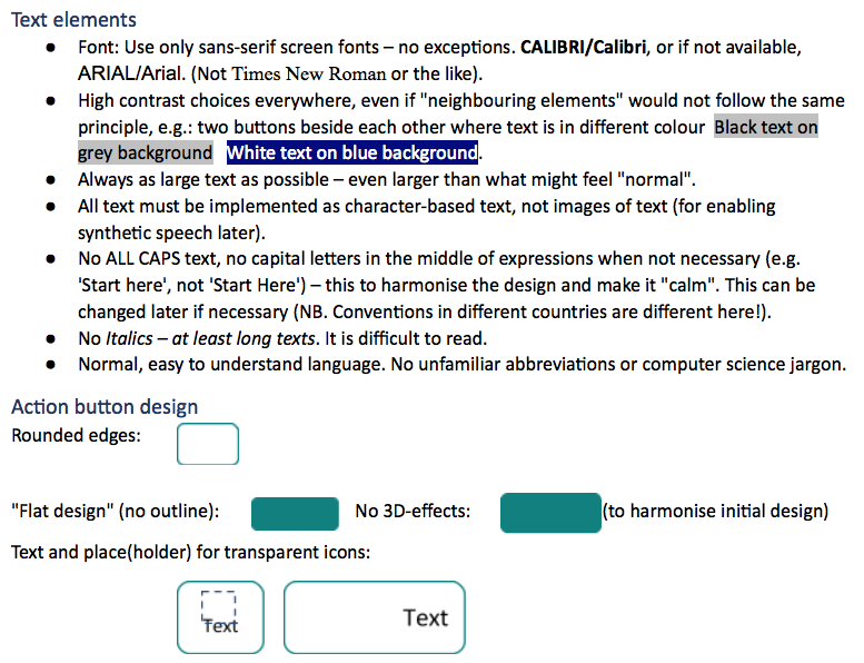
- The main requirement is good contrasts everywhere, in all elements of the user interfaces.
- Make the colour “skins” available in an easily adjustable way, not hard-coded in all SW.
- For (at least) first prototypes, start with light backgrounds and dark text, buttons etc.
POSEIDON colours:
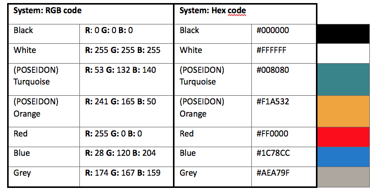
For visually impaired users, a POSEIDON primary user application should provide high contrast alternatives, such as black-and white palettes, in addition to the “branded” POSEIDON palette. This is very important for the readability of the text elements.
Icon library
A set of icons developed in the POSEIDON project is available as part of the framework: http://www.poseidon-project.org/product/symbols/
Here are some guidelines for creating new icons:
- All icons must be designed as transparent images, with high contrast against all possible backgrounds.
- All icons must follow “similar design”. E.g., not a mixture of photo icons, pencil drawings and high quality graphics.
- Icons should when possible be combined with text.
- Symbols and terminology should be used consistently throughout the applications and systems in POSEIDON.
Decorative elements
- Do not use any unnecessary decorative elements such as boards, background images or the like.
- Do not use any animations (moving, blinking items) if not necessary for explaining something, e.g. a screen-cast connected to user support sections.
Navigation
- Allow the user to go back or “regret”.
- Allow the user to start from beginning (Home, Start page).
- Show the user where s/he is “just now”.
Scrolling
- Avoid scrolling.
- Avoid horizontal scrolling.
Actions and feedback to end user
- Let the user initiate actions, e.g. by clicking on buttons – even if not technically necessary.
- Acknowledge actions: show that a button is clicked on, that something may take time etc.
Language, national data formats
- Create a language library which allows alternative expressions and new languages be deployed without re-programming all software.
- Dedicate a work force to create an as compact and easy-to-read language as possible, especially for buttons.
- Make it possible to use familiar (diverse) formats for date, time, monetary units etc.
Help and support
- Provide help. Enable help to be added to the software “anywhere”.
- Use commonly understandable, clickable symbols for more information, e.g.

- Do not require the user to type information that the system already knows.
Look and feel
- We want the POSEIDON software to be as familiar and self-explanatory as possible.
- Strive for realisation of look and feel. Look and feel is a term used in respect of a graphical user interface and comprises aspects of its design, including elements such as colours, shapes, layout, and typefaces (the “look”), as well as the behaviour of dynamic elements such as buttons, boxes, and menus (the “feel”).
- Create family resemblance between all parts of the POSEIDON software by sticking to the rules in this document – even if you would personally disagree with something.
- Brand all apps with the POSEIDON app logos or banners. However, do not let these dominate the interface.
Responsive design
- We want the POSEIDON software to be usable across a variety of devices, depending on the end user’s preferences.
- Strive for realisation of responsive design. Responsive web design is an approach to web design aimed at crafting sites to provide an optimal viewing experience—easy reading and navigation with a minimum of resizing, panning, and scrolling—across a wide range of devices (from desktop computer monitors to mobile phones).
Accessibility
- We want the POSEIDON software to be usable, useful and easy to use for a variety of end users with different levels of abilities.
- Strive for realisation of accessible solutions on all POSEIDON platforms. Accessibility can be viewed as the “ability to access” and benefit from some system or entity. The concept focuses on enabling access for people with disabilities, or special needs, or enabling access using assistive technology.
- This document is just a short “start package” for the software team. For all more advanced accessibility issues, se accessibility guidelines such as.
Android user interaction implementation
We have collected guidelines and tips for user interface implementation on the Android platform. A more extensive text on the subject can be found in deliverable D4.5, chapter 4. The following points are extracted from that text.
- The Android system usually have three navigation buttons/icons along the bottom of the screen, such as back and home buttons. They are the intended way to navigate between functions in the device, and some of them are completely outside the control of the app. Make sure to take both their functions and positions into consideration when designing a user interface.
- Using the back button, the user should be able to backtrack in our app, and leave the app when backtracking beyond the first screen.
- The Android navigation and system bars can be hidden when not needed, to maximize the available screen space, but keep in mind that the user can always bring them back. Since we cannot completely hide or control them, it may be best to leave them on screen, to avoid confusion.
- Try to minimize the need for keyboard input, as the on-screen keyboards on Android devices can be quite small and cumbersome to use.
- When keyboard input is available, make sure that the layout can handle the keyboard taking over much of the screen space. Make sure the keyboard does not hide the most essential information on the screen.
- Keep in mind that an application can lose focus or be shut down at any time (such as when the user presses the home button, or a phone call comes in). Make sure that the state of the application is preserved when this happens, and restored when it is shown again.
- Save changes made by the user when the user leaves a view. Show a little message to notify the user that changes were saved.
- Try to keep a clear separation between the user interaction logic and the concrete implementation in graphical elements, so that it is possible to change this implementation or provide alternatives based on user abilities and preferences.
- Use the Android resource system with qualifiers for alternative versions of resources. This makes it easy to handle adaptations to different languages, screen properties, colours and styles.
- Do not define text, font size, dimensions or colours directly in a layout file. Such properties are best defined one time in their own resource files, and referred to in layouts. This way they can be varied and changed independently of each other.
- To follow our user interface guidelines, we want to minimize the need for scrolling. However, designing a good layout without scrolling can be very difficult, depending on how much variability we want to support in terms of different screen sizes, font sizes and languages (text may be much longer or shorter when translated to a different language). We therefore need to make trade-offs. When scrolling is necessary, it is good to show the most important information first, and make it clear that there is more information.
- A mobile device screen can be used in either horizontal (landscape) or vertical (portrait) orientation. For phones and smaller tablets, the portrait orientation tends to be the natural way to hold the device, except for when looking at film or photos, while a larger tablet is seldom held this way. Either design the layouts to work well with both orientations, or design for only one of the orientations and restrict the user interface to this orientation.
- Android devices have different Android versions and manufacturer customisations. Keep this in mind and try to target as broad a scope as possible.